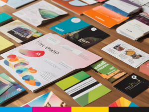
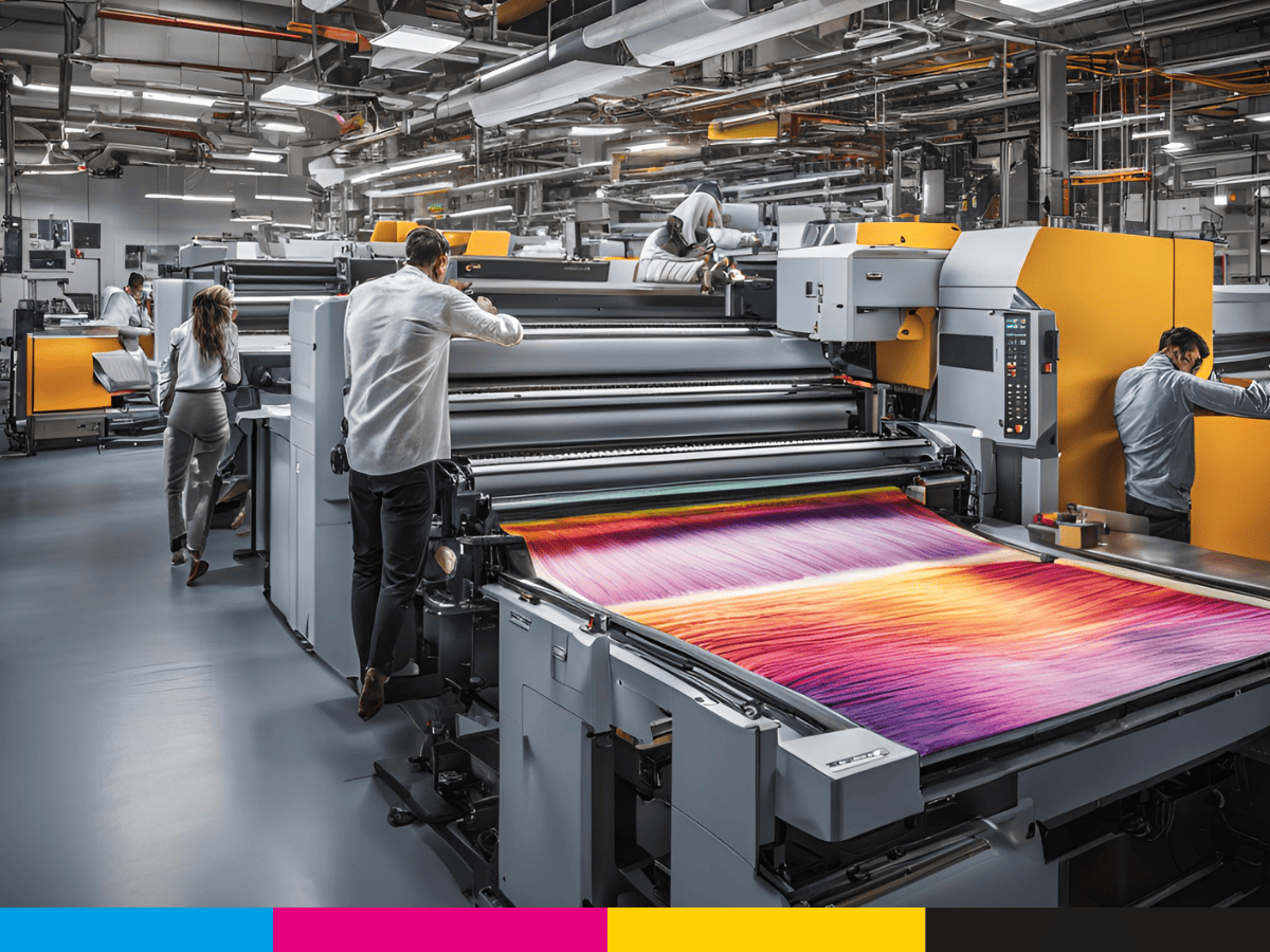
When it comes to getting your business’s marketing materials printed, whether it’s for branding, signage, or large-format prints, you want the end result to be perfect. After all, printed materials are often the first impression your business makes on potential customers. But while the printing process can be straightforward, there are common mistakes that can turn your project into a headache. Avoiding these mistakes can save you time, money, and frustration.
In this article, we’ll walk you through the top mistakes to avoid when sending files to a printing company. Whether you’re printing brochures, banners, flyers, or large-format signage, knowing what to avoid will ensure your project runs smoothly from start to finish. So, let’s dive in and make sure your next printing job is a success.
1. Not Using the Correct File Format
One of the most common mistakes when sending files to a printing company is not using the right file format. Different printers and printing processes require specific file types to ensure the best possible print quality. Sending the wrong file format can lead to delays, poor print quality, or even higher costs.
What you need to know about file formats:
- PDF (Portable Document Format) is often the preferred format for printing because it preserves the layout, fonts, and images. It’s a safe bet for most printing jobs.
- TIFF (Tagged Image File Format) is commonly used for images with high resolution and quality.
- EPS (Encapsulated PostScript) is another vector file format that works well for logos and other scalable designs.
Common mistakes to avoid:
- Sending editable files such as Word documents or PowerPoint presentations, which can lose formatting when printed.
- Sending images in low-resolution formats like JPG that might not print clearly.
Tip: Always check with your printing company to find out what file formats they prefer. This ensures your files are ready to go and reduces the risk of issues later.
2. Ignoring the Bleed Area
The bleed area is a vital part of print production. It’s the portion of your design that extends beyond the trim size and ensures that there is no white space or unprinted area at the edges when the print job is cut down to size.
Without a bleed, you risk having a thin white border around your printed material, which can look unprofessional. This is especially important for large-format printing and signage, where even a small error in cutting can be very noticeable.
What to do:
- Set your file with a bleed area (usually 0.125 inches or 3mm) beyond the actual trim size.
- Ensure that images and backgrounds extend into the bleed area to cover the entire design.
Common mistakes to avoid:
- Forgetting to add bleed area altogether.
- Placing important text or images too close to the edge of your design, which could be trimmed off.
Tip: Double-check the bleed settings in your design software and confirm the bleed specifications with your printing company to avoid cutting issues.
3. Using Low-Resolution Images
When sending files to a printing company, image quality is crucial. Low-resolution images (typically under 300 DPI) will look blurry and pixelated when printed, especially in larger sizes. This can significantly affect the quality of your printed collateral and lead to disappointing results.
For signage and large-format printing, high-resolution images are particularly important since these materials are often viewed up close or from a distance. Any imperfections in image quality will be glaringly obvious.
What to do:
- Always use images with at least 300 DPI (dots per inch) for print. This ensures crisp, clear images.
- Avoid stretching images beyond their original size, as this will lower the resolution and cause distortion.
Common mistakes to avoid:
- Using web images or images taken from social media, which are often low resolution.
- Not checking the resolution before sending files.
Tip: If you’re unsure about the resolution of your images, ask your printer to check it before production begins. Some printers offer services to help adjust image quality.
4. Choosing the Wrong Color Mode
When preparing files for printing, color mode matters. RGB (red, green, blue) is the color mode used for digital screens, while CMYK (cyan, magenta, yellow, black) is the color mode used for print. Sending files in RGB can result in colors that look different once printed because printers use a different color process than screens.
For any printed marketing materials, such as brochures or large-format prints, you need to use CMYK color mode to ensure that your printed colors match what you see on your screen.
What to do:
- Convert your files to CMYK before sending them to the printing company. This helps ensure color consistency.
- Use Pantone colors for precise color matching, especially for brand identity and logo printing.
Common mistakes to avoid:
- Sending files in RGB without converting them to CMYK, resulting in color discrepancies.
- Ignoring Pantone colors for brand consistency, which can lead to variations in the printed outcome.
Tip: Always confirm the required color mode with your printer, especially for projects that involve specific brand colors.
5. Not Accounting for Paper Type and Weight
The paper type and weight you choose for your printed materials have a significant impact on the look and feel of the final product. Whether it’s a flyer, brochure, or signage, selecting the wrong paper can undermine the professional appearance you’re aiming for.
For example, using too thin or low-quality paper for your business cards or brochures can make them feel flimsy, while thick, heavy stock may be overkill for a simple flyer.
What to do:
- Consider the purpose of your print material. For example, business cards might need thicker stock to convey quality, while flyers can often be printed on a lighter weight paper.
- Discuss paper options with your printer and choose one that suits your design and budget.
Common mistakes to avoid:
- Failing to choose the right paper weight, resulting in materials that feel cheap or too heavy.
- Not considering how the paper type might affect your design, such as glossy paper causing glare or matte paper affecting color vibrancy.
Tip: When in doubt, request a sample of different paper stocks from your printer to find the one that best fits your design and purpose.
6. Forgetting to Proof Your Files
One of the simplest but most critical steps is proofing your files before sending them off to the printer. Errors in text, layout, and design are easy to overlook but can be costly if left unaddressed.
What to do:
- Proofread your text for spelling and grammatical errors.
- Double-check your layout, ensuring that everything is aligned and properly placed.
- Review colors, images, and any other design elements to ensure they match your expectations.
Common mistakes to avoid:
- Skipping the proofreading step and submitting files with errors.
- Not reviewing how your designs will look once printed, especially when it comes to the trim lines, bleed area, and overall presentation.
Tip: Print a test copy (or request a digital proof) before committing to a full print run. This allows you to catch any errors or issues in the physical form.
7. Not Confirming Final Specifications with Your Printer
Every printing project is unique, and different printers may have different requirements or preferences. Failing to confirm specifications can lead to issues like incorrect dimensions, wrong paper choice, or mismatched colors.
What to do:
- Discuss your project in detail with your printer to confirm all specifications, such as file format, color mode, paper choice, and bleed.
- Get written confirmation on the turnaround time and the expected delivery date to avoid any surprises.
Common mistakes to avoid:
- Assuming your printer knows all the specifics without double-checking.
- Not getting clarity on turnaround times, leading to missed deadlines.
Tip: Always communicate clearly with your printer and ask for a final checklist of specifications to ensure everything is set up correctly.
Avoid Printing Pitfalls for a Smooth Experience
Sending files to a printing company might seem straightforward, but as we’ve discussed, it’s easy to make mistakes that could negatively impact the final product. By avoiding common mistakes like using the wrong file format, neglecting bleed areas, and choosing low-resolution images, you can ensure your printed materials look professional and meet your expectations.
Remember, clear communication with your printing company, attention to detail, and thorough proofing are key to a successful print project. With these tips in mind, you can avoid costly errors and maximize the impact of your printed marketing collateral—whether it’s for branding, large-format signage, or any other printed material.
At APPi, we understand the importance of high-quality printing and can guide you through the process to ensure your project is a success. Don’t hesitate to contact us for assistance with your next print job!

If you found this article helpful, be sure to visit our latest piece on our Ink Pedia Blog for more insights into sustainable practices, innovative technologies, and effective strategies to enhance your brand. Don’t miss out on valuable information that can take your printing projects to the next level!
Looking to make a lasting impression? Explore our catalog of promotional products for unique, customizable items that elevate your brand. From custom apparel to branded merchandise, we have everything you need to leave a memorable mark at events and beyond. Visit now to find the perfect promotional items for your next campaign!


